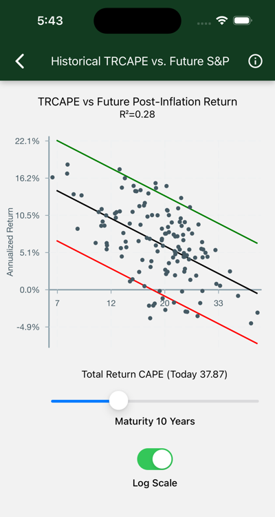
Is past performance any guide to future stock market returns? Efficient market theorists say “no,” but their claims are not universally supported. Robert J. Shiller, the Nobel Prize winning economist, explored this question in 1997, using data you see in this chart.
Data
Each dot on the chart represents a stock purchase made in one year.
TRCAPE appears on the x-axis. Computed from ten years of prior Standard and Poors 500 data, it is the ten-year average of individual Price/Return ratios, where Price is the inflation adjusted value of the S&P index, and Return is the annualized total real past ten-year return, including reinvested dividends, on the S&P investment. Consider it like a P/E ratio, smoothed over 10 years, and accounting for stock buybacks as well as just earnings. TRCAPE is historically high lately, suggesting that stocks are overvalued. Consult the background material below for how this statistic was developed and named.
Annualized Real S&P Return appears on the y-axis. This is the annualized total real return of an S&P investment, including reinvested dividends, over a given Term.
Term appears in the slider at the bottom of the page. This is the number of years the investment is held. As the term increases, returns draw closer to the historical rate of around six percent after inflation.
The black line is the best fit. Error bars capture about 95% of the data points. On the logarithmic scale the R-squared statistic is shown. This is interpreted as the percentage of variation accounted for by TRCAPE. An R-squared of zero would appear with a horizontal line, indicating no effect; if R-Squared were 1.0, we would see a perfect fit, with all the dots on the black line.
Interpretation
Big TRCAPE bad; little TRCAPE good. At any maturity:
- With low values of TRCAPE, on the left side of the chart, returns are high, indicating undervalued stocks.
- With high TRCAPE values, real returns drop, indicating overvalued stocks. The chart shows TRCAPE at 37.87. Note that all the dots on the extreme right of the illustrated chart fall below zero.
The quality of our predictions depends on the maturity we are looking at.
- The illustrated chart shows results for ten year maturities. R-squared is 21%
- If you move the maturity slider all the way left for a maturity of one year, R-squared drops to .04 and returns are all over the map, confirming that returns are basically useless for predicting future returns at short maturities.
- Move the maturity slider to 30 years. R-Squared goes to .21 and the dots are all well above zero. We are seeing the market returning to its historical real earnings of about 6%. The effect of our current conditions will be little felt thirty years from now.
Background
Shiller’s analysis is encapsulated in Valuation Ratios and the Long-Run Stock Market Outlook Shiller and his co-author, John Campbell, presented his findings to the Federal Reserve Board of Governers December 3, 1996.
In Shillers presentation, he described a statistic he called the “cyclically adjusted price-to-earnings ratio”, abbreviated “CAPE”, “CAPE10”, or “Shiller P/E”. This statistic is computed as the average P/R is described here, except that earnings appear in the denominator instead of total return. This statistic is available daily on financial sites.
As corporations incorporated stock buybacks into their strategies, investors sought a measure that incorporated total return. Shiller responded in 2018 by publishing a “total return CAPE”, or TRCAPE, the measure Hedgematic uses.
Shillers’ publicly accessible papers are linked at Home Page of Robert J. Shiller.
The data displayed on this page is sourced from ie_data.xls, which is linked from Shiller Data.